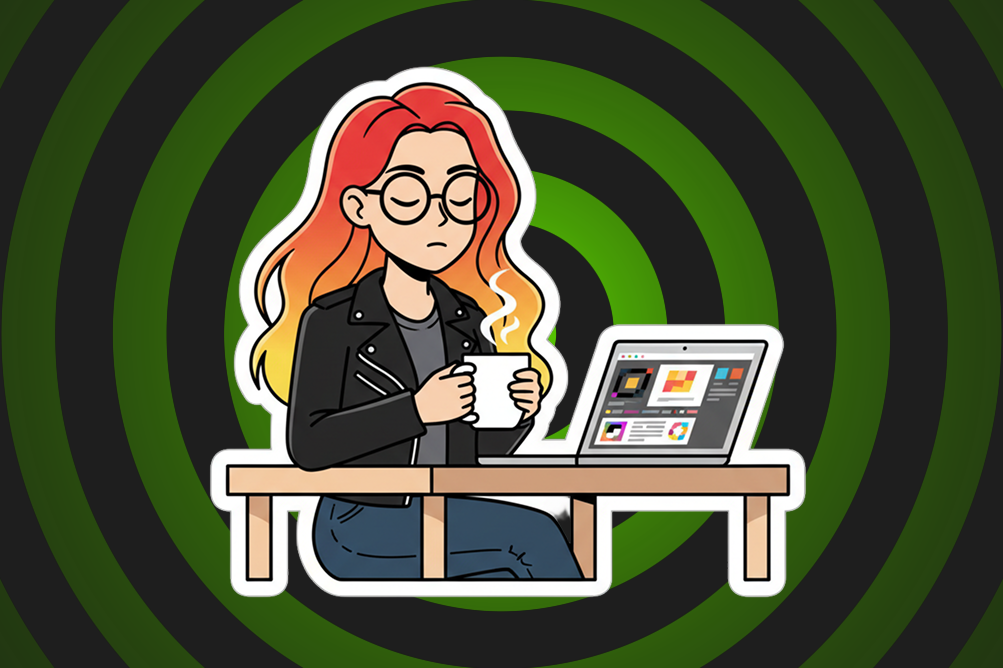
Dear designers, marketers, and whoever keeps approving these ads and presentation slides…Please. Stop. (Sigh
For 2 reasons…
Firstly, centre-aligned text is already harder to read because your eyes have to hunt for the beginning of every line. Then someone decides to make it ALL CAPS as well. Now we’re not reading anymore. We’re decoding.
Yes, it can work. For a logo. A headline > Three words.
Not everything needs to shout to get attention btw. It might look bold. It might look “premium.” But if I have to squint and mentally reconstruct every sentence, we’ve forgotten the first rule of communication:
> People need to read it. Typography isn’t decoration. It’s UX.
Every choice – alignment, spacing, line length, hierarchy, and capitalisation – either helps people understand your message or slows them down.
And before anyone says, “But it looks nice…” Comic Sans has fans too.
Secondly, somewhere along the way, it became the default style for every second advert, presentation deck, and inspirational quote on LinkedIn.
It’s overused! I’m so bored of seeing it. Where is your creativity?!
So here’s my humble request:
If your slide contains more than five words…
Left-align it. Use sentence case. Save centre alignment and ALL CAPS for when they genuinely add impact – not because they’re trendy and everyone else is doing it.
Rant over. Until the next centre-aligned manifesto appears in my LinkedIn feed… sigh.