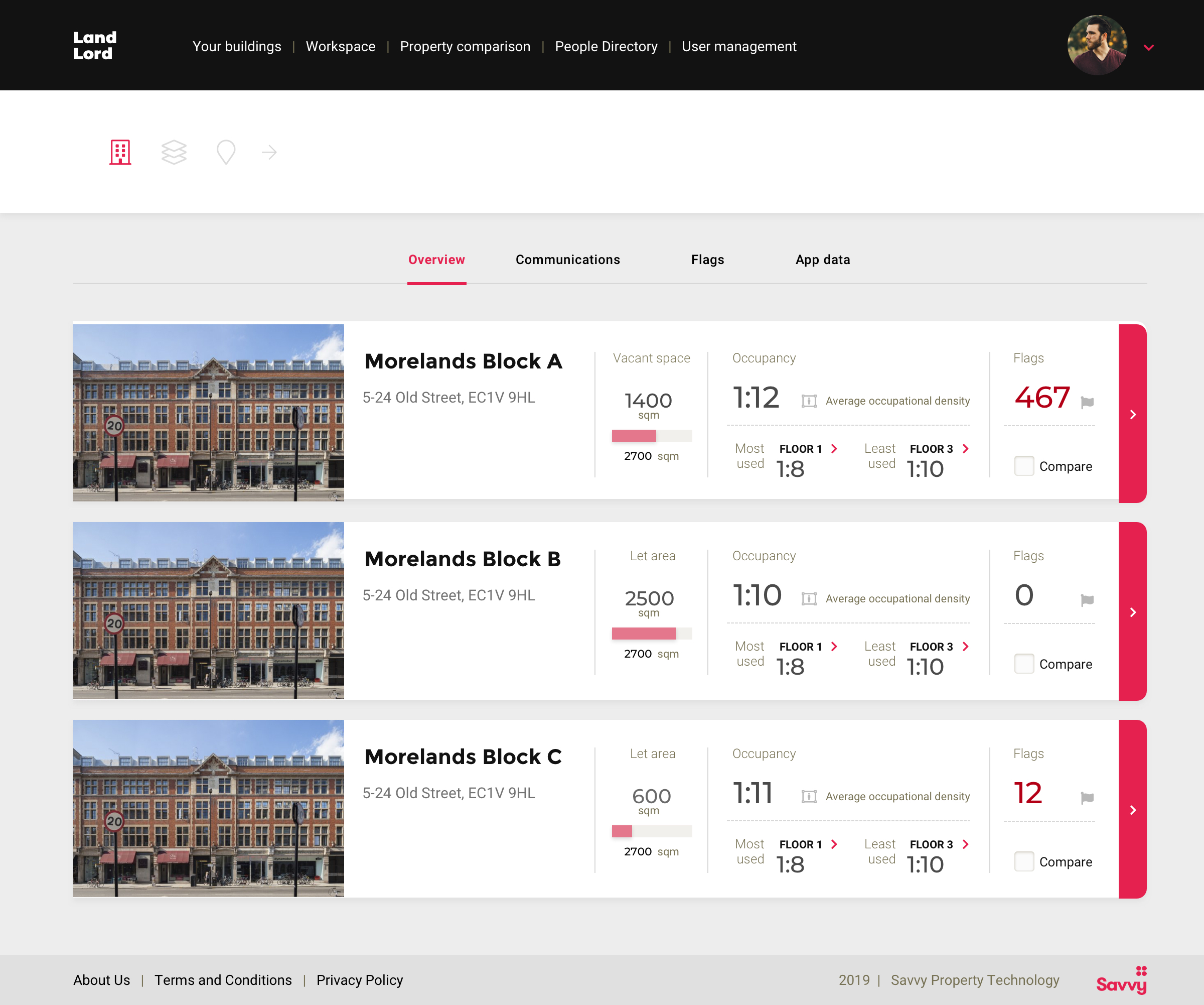
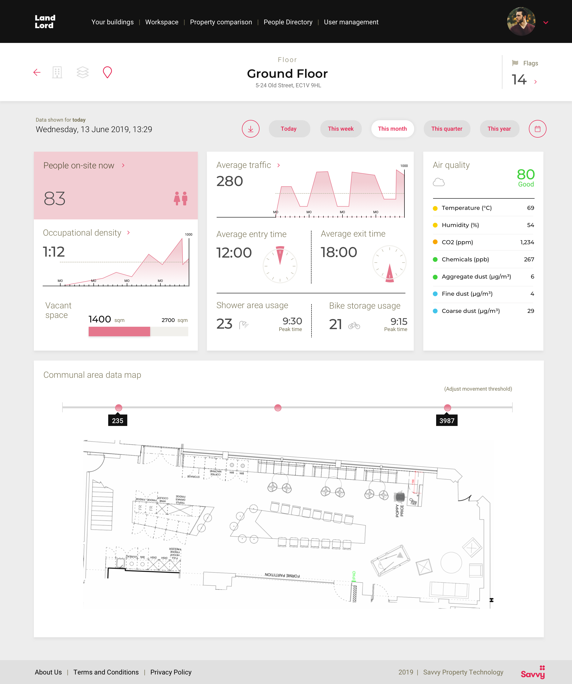
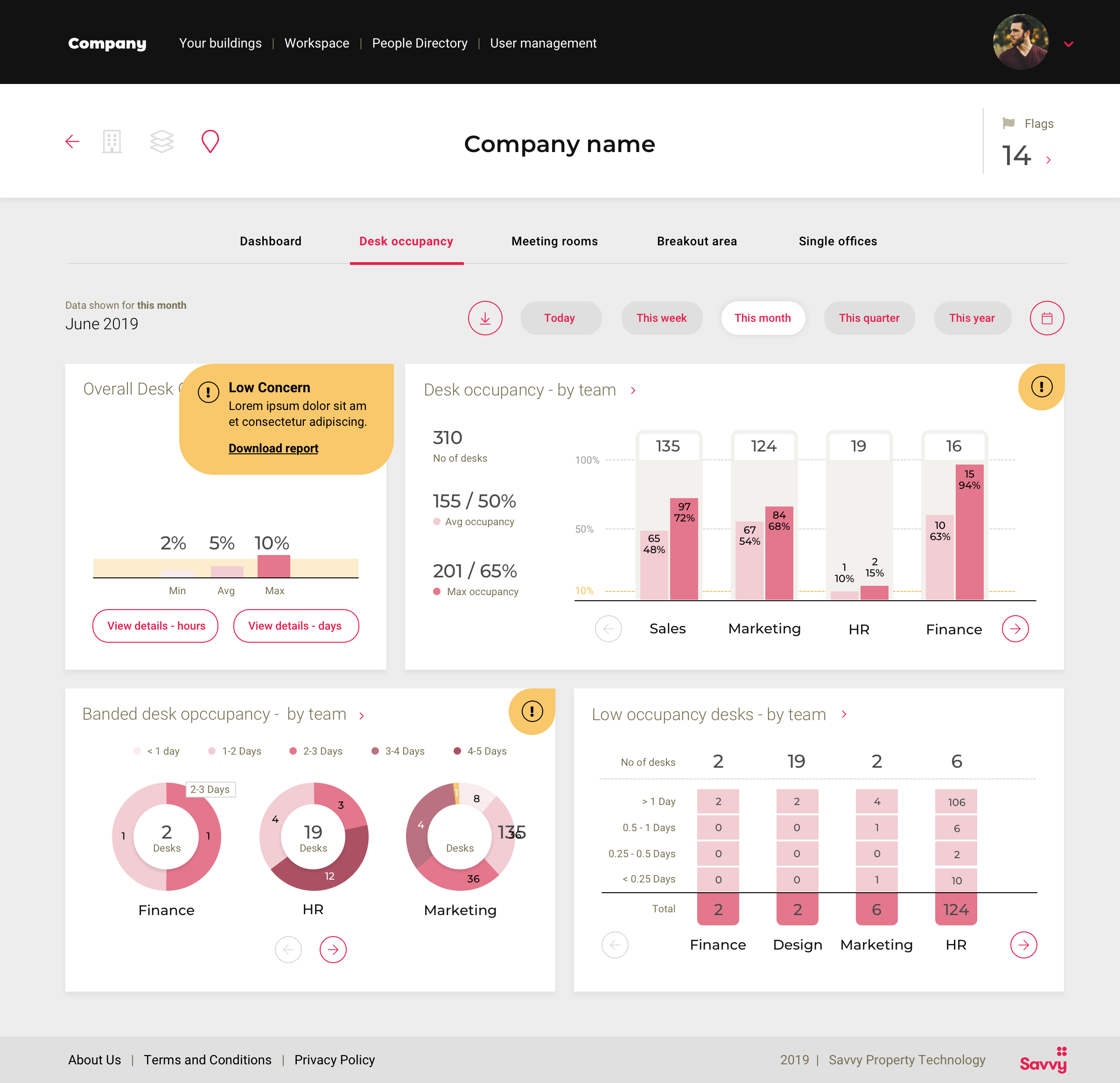
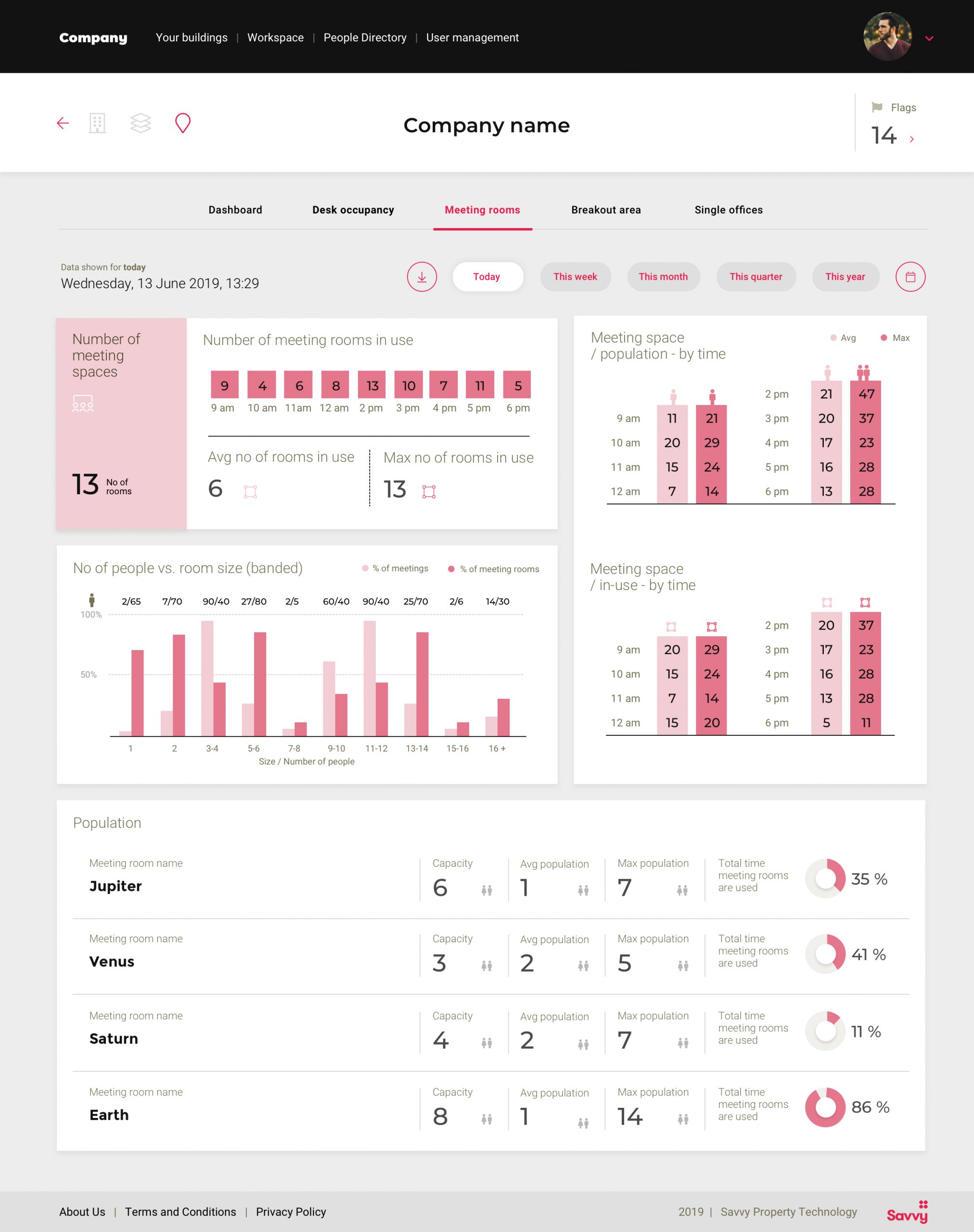
The desktop app delivers day-to-day activity data of the building so help cost efficiency and improve the work environment. Analytics and stats give the building landlord, building manager and employer an overview of the building usage such as occupancy levels, user flow heat maps and granular detail of desk and room usage and air quality.
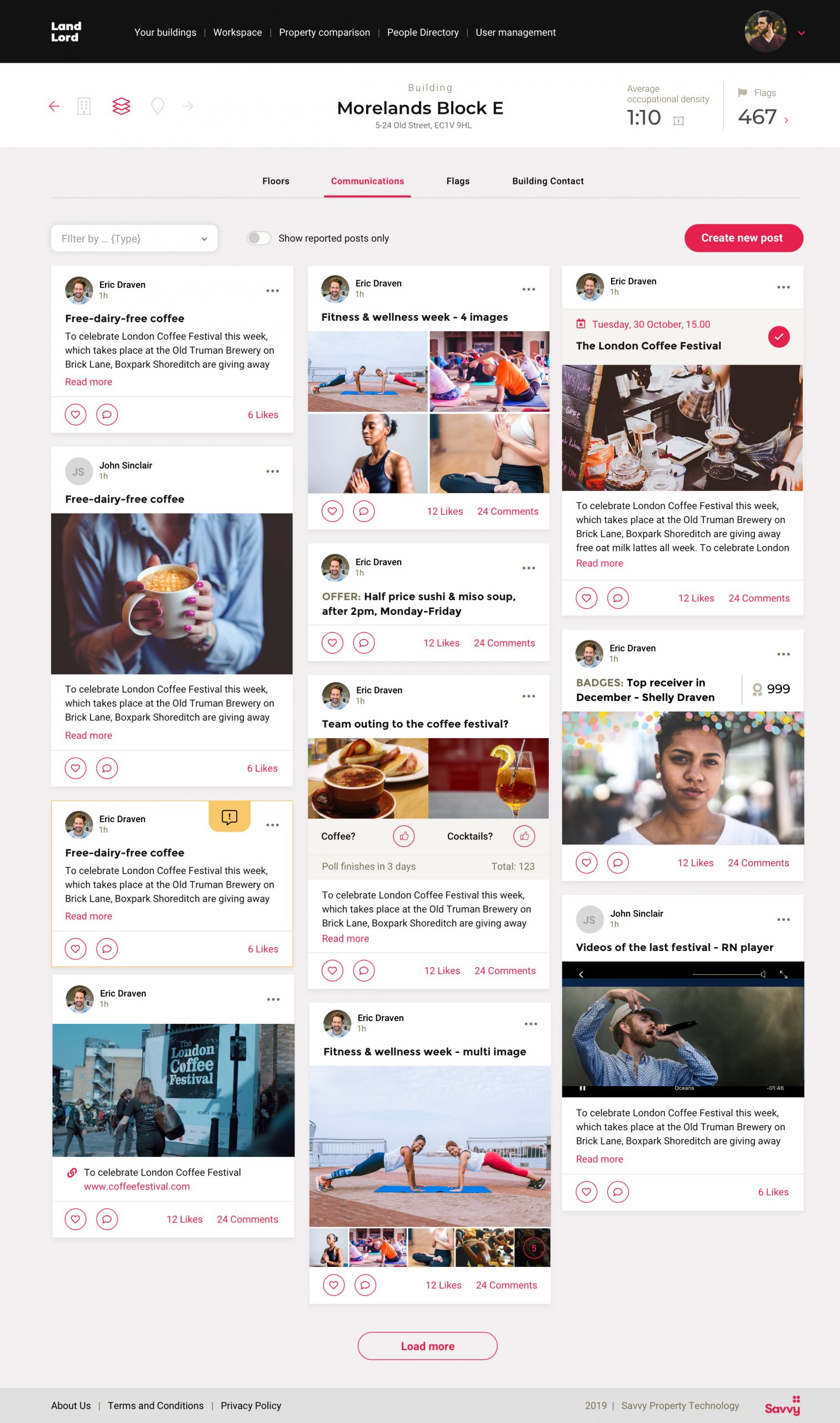
The user-friendly dashboard displays complex data breaking it down into logic sections. There are different type of data for different user groups (admin, landlord, office manager, company). The data feeds in from different sources e.g. sensors installed on the ceiling and desks. Key was to display the flood of data as simple graphs and to break down the information into logic steps from building to blocks to floor to company to an very granular view. Including features like flags and posts (published on the mobile app for employees)
Challenge was to find the most logic structure and to visualise the data in the best possible way for all user journeys.
MY ROLES: Concept / User interface design / Data visualization